As a Junior Designer at MarketingFile I am finding new design challenges every day, for our own marketing and for that of our clients.
Before I started here I had pretty much stuck to print design but I was eager to tackle designing for the web and start learning code. In my interview I loved how much MarketingFile wanted to support me in this process and to help me achieve this goal and eventually be able to design websites, landing pages, emails – the whole portfolio. I jumped at the chance to learn and gain experience and within the last month I have learnt more than I could imagine. So, I thought as a junior to this, I’d share my experience and knowledge so far to help anyone else learning the fundamentals of this – enjoy my first blog entry!
Responsive design – Being able to code is one thing but responsively is whole other issue.
What is it?
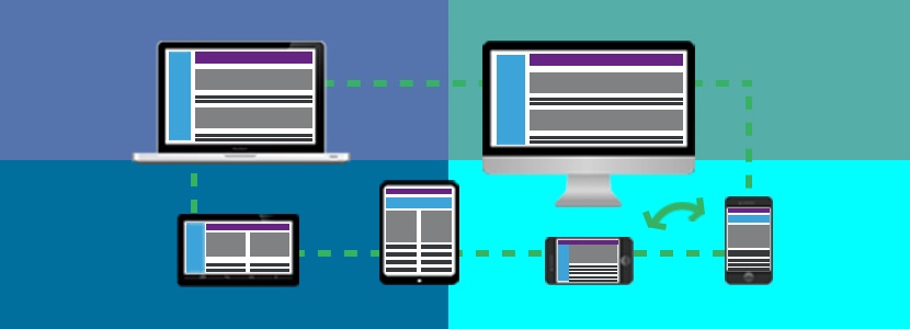
It was originally coined by Ethan Marcotte and refers to an approach that allows for the best possible user experience when content is being viewed and interacted with on the web. With the growth in technology there are a variety of different portals people can access the Internet through such as their mobiles, tablets, notebooks etc. and they expect to be able to view content on the web just as easily as they can on their desktops. Having a ‘mobile’ version is just not enough. Your webpage needs to adapt for all screen sizes and resolutions, creating a version for each device is not the solution, not to mention impossible. This is where responsive design comes into play. Before coming across this issue, like many people, when browsing on my phone or tablet I never gave a thought to what was actually happening behind the scenes to make it possible.
There’s no easy fix and requires a whole new way of designing that involves a range of different techniques such as media queries, fluid grids and images. Fortunately for me, I get to pick up from here and start using these methods from the get go.
Media Queries: These are a set of CSS styles that can be applied to render the contents’ display type, resolution, width, height and orientation in accordance to the device it is being viewed on. These attributes are applied within a @media rule and are filtered out and applied only if the condition is true. For example, the below commands that for any screen between 0px and 420px wide, the background colour will be #000000 (black).
/* ——————-
MOBILES
——————- */
@media screen and (max-width:420px) {
body {
background-color: #000000;
}
Fluid Grids and Images: This is a method used to allow content to flow effortlessly in size without manually applying widths. Instead, it uses percentages in place of pixels to position content proportionately that adapts naturally in relation to the manipulation of its container. Below is a helpful formula I have found:
Target / Context = Result
e.g. Your target component is 200px wide and it is going to sit inside a 580px container
200 / 600 = 0.333333
Then x 100 to turn this into a percentage
33.33333333%
This method also applies to images. By working out the percentage of the image in comparison to the percentage of the overall width of the page, its’ scale will always stay in relation to the rest of the content.
Why is it important? – See the stats!
It is becoming increasingly important to have a responsive web design as more and more users are viewing on portable devices.
- 40% of people will leave a website if it takes more than 3 seconds to load
- 4 out of 5 consumers shop on smartphones
- 70% of mobile searches lead to action on websites within one hour
- 40% of people will choose a different search result if the first is not mobile friendly
- 80% of people delete an email if it doesn’t look good on their mobile device
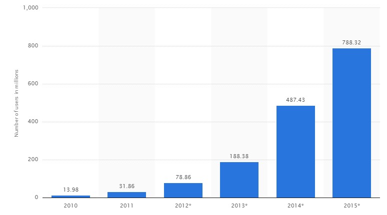
Wow! The graph below shows the global number of mobile-only internet users from 2010 to 2015 (in millions) from statista.com

What do I think?
Ultimately, by having an unresponsive web page and not considering all users you can effectively be sending your prospect customers to your competitor’s site. Don’t have your users messing about panning and resizing the page, get them focusing on your services and products!
Design responsively.
By Aisling McCagh, Junior Designer, MarketingFile
Would you like assistance in making your website, emails and landing pages responsive? Our design team would love to help
Take a look at some of the creatives we have designed for our clients recently.
Don’t be afraid to spend a little
False economy creeps in when printing costs are being discussed. Printers often steer clients away from ‘expensive’ paper stocks, and from extra colours in the print run. You should weigh up your decision in terms of the extra sales that a better quality promotional piece can bring, against the ‘cost’ of having a cheaper brochure ‘down sell’ your business.
For a free quote for your next direct mail campaign contact our team on 0845 345 7755


